OneOfTheFew
Industry
Fashion
Client
OneOfTheFew
Service
Visual Identity
Year
Year
2020
Industry
Fashion
Client
OneOfTheFew
Service
Visual Identity
Year
2020

OVERVIEW
OneOfTheFew is a streetwear brand built on the belief that individuality should be celebrated—not suppressed. Rejecting conformity and societal norms, the brand speaks to those who move against the grain and live by their own rules.
The logo direction centers on a bold geometric mark: a grid of nine circles forming a square, with the upper-right circle breaking free from the structure. This lone circle symbolizes self-determination, resistance, and standing apart. Black and white serve as the core brand colors, used consistently across applications to express confidence and strength. A flexible pop of color is reserved for the “breakaway” circle, shifting with each collection to represent constant evolution.
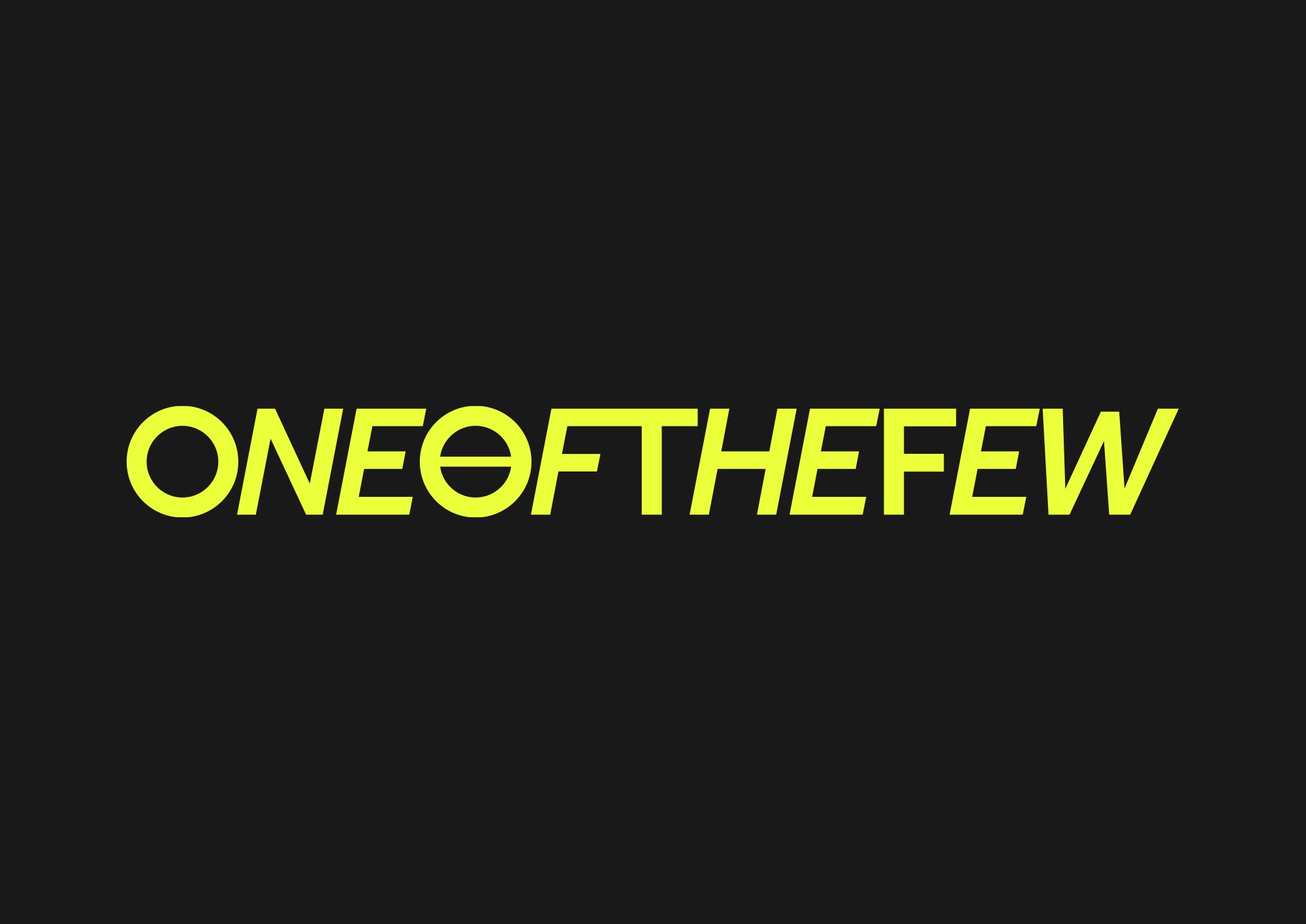
The identity system includes multiple logo versions: the primary mark, a custom wordmark, vertical and horizontal lockups, and acronym-based variations. Together, they form a cohesive yet adaptable identity that mirrors the brand’s philosophy of freedom through design.
OneOfTheFew is a streetwear brand that challenges conformity and embraces individuality. Its logo design features a grid of circles with one breaking free—symbolizing independence and nonconformity. Designed in black and white with a flexible accent color, the visual system includes multiple logo versions for a bold, adaptable presence.