Neal Clement
Industry
Creative
Client
Neal Clement
Service
Visual Identity
Year
Year
2022
Industry
Creative
Client
Neal Clement
Service
Visual Identity
Year
2022
OVERVIEW
Neal Clement is a Nashville-based motion designer and creative director who wanted a visual identity that could reflect his dynamic work and function well across different contexts. The identity centers around a bold, custom wordmark supported by a complementary logo mark and a tagline designed to stand on its own. All elements were developed to feel cohesive whether used together or separately.
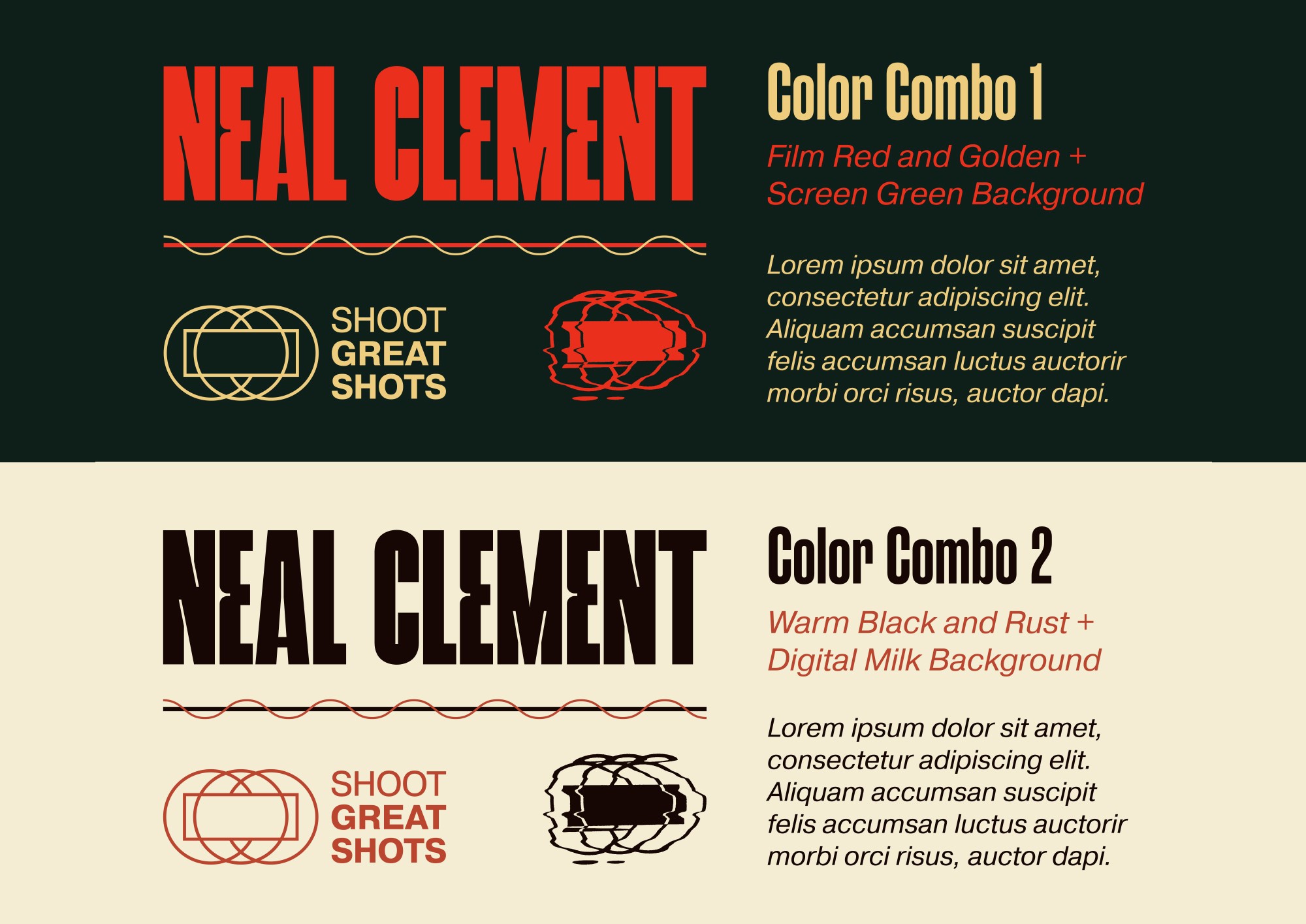
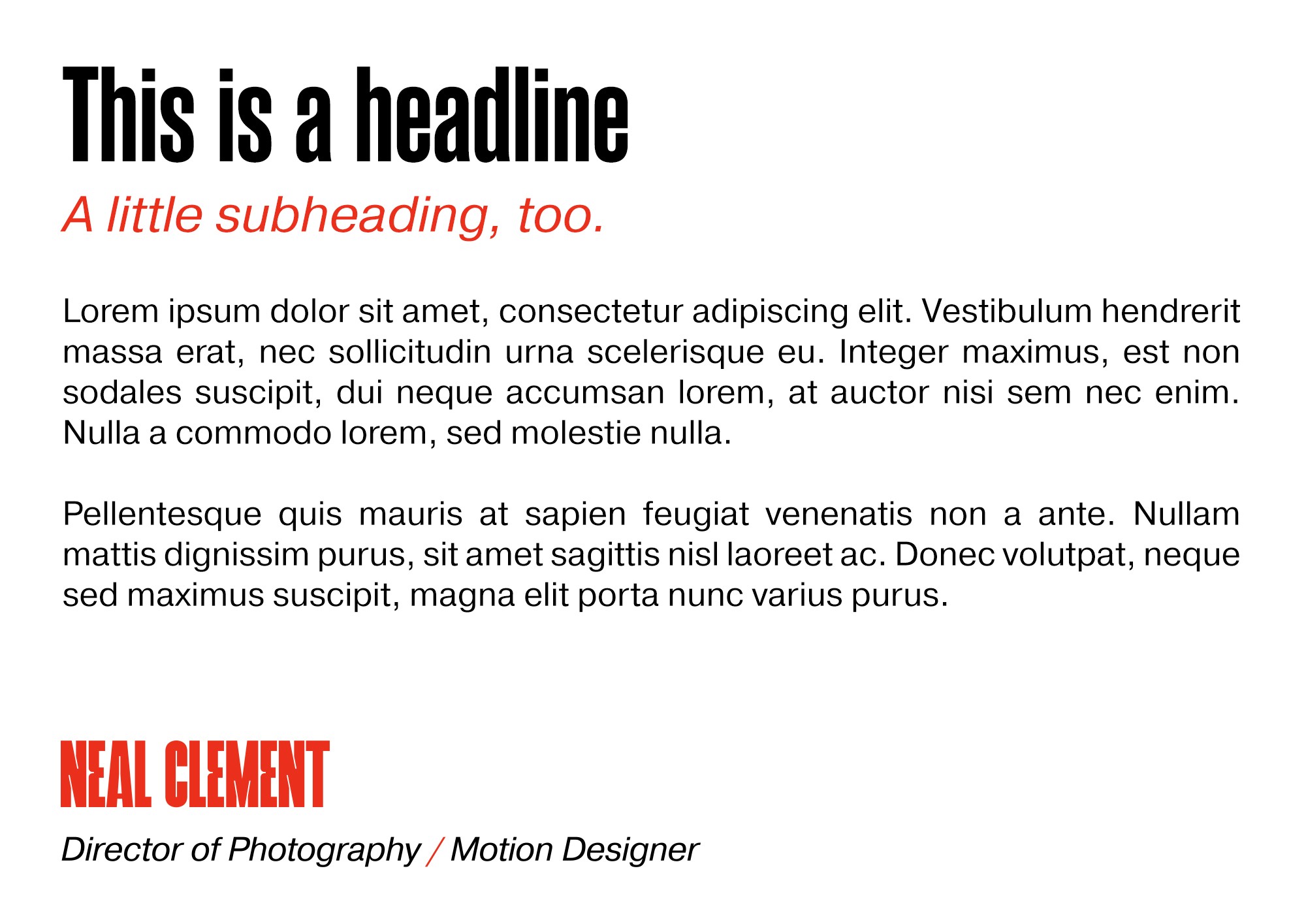
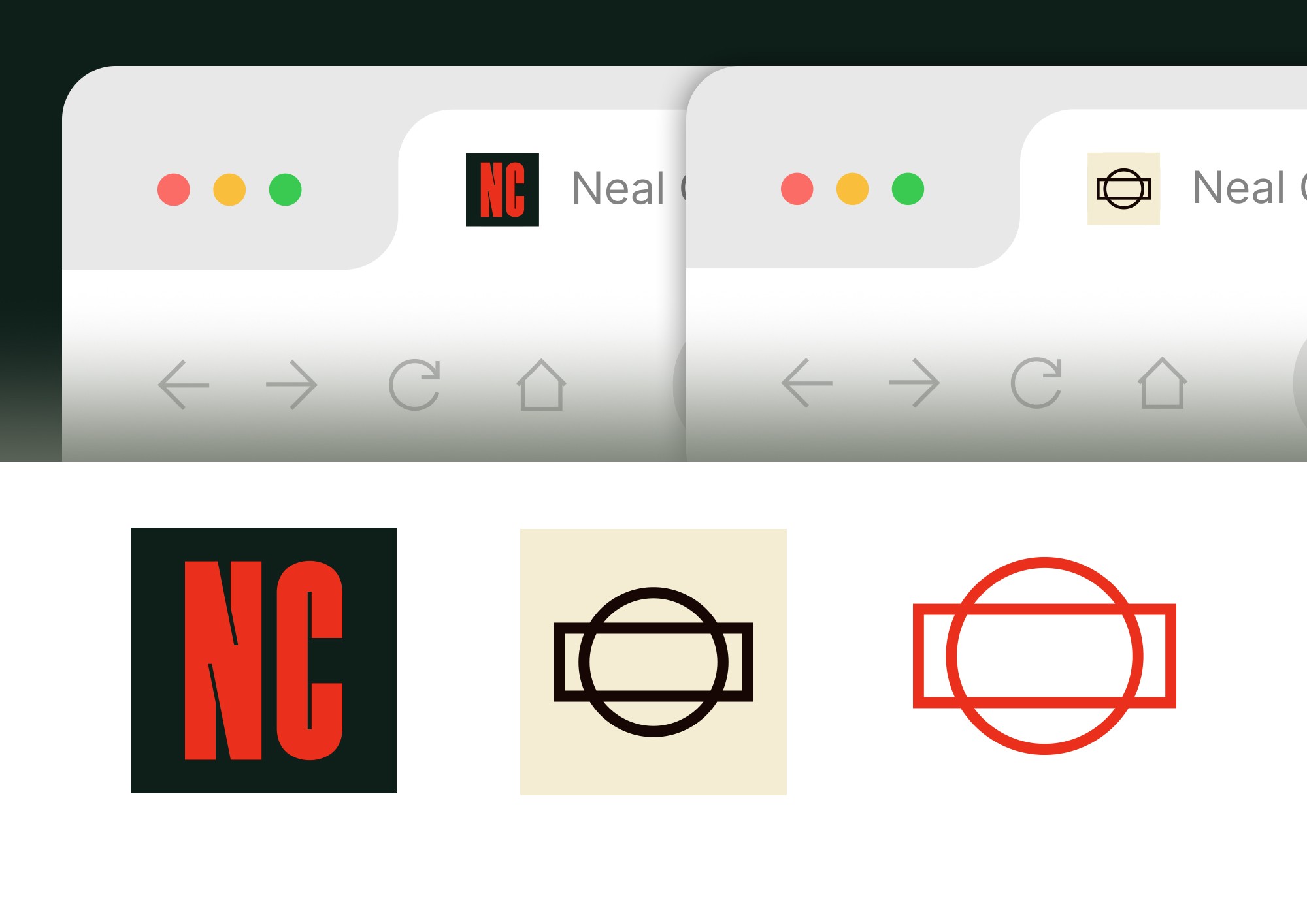
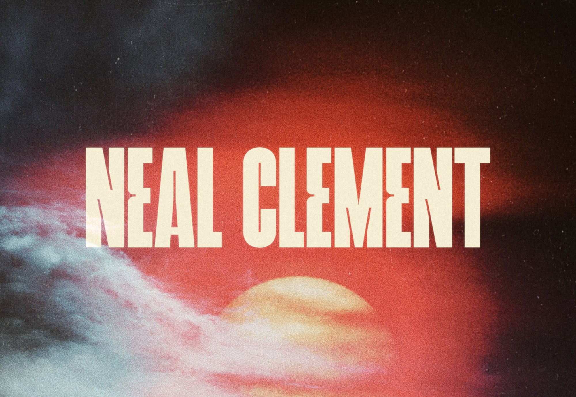
Inspired by film grain, analog video glitches, and pixelation, the visual system includes a series of logo variations created by scanning, distorting, and vectorizing the core assets. These static distortions hint at movement and open up possibilities for future animation and motion graphics. The vivid red-orange is the brand’s most prominent color, while two warm-toned blacks add depth without the harshness of true black. A muted gold and soft beige round out the palette to reinforce a retro and tactile warmth. The typographic system mirrors the energy of the wordmark, featuring bold, narrow letterforms for display and a practical sans serif for body copy.
Neal Clement is a motion designer and art director based in Nashville. His identity features a strong custom wordmark, a complementary logo mark, and a tagline that can stand alone. Inspired by video glitches and film grain, the visuals include distorted, vectorized logo variations to suggest movement. A vivid red-orange leads the color palette, supported by warm-toned blacks, muted gold, and beige. The typography includes bold, narrow headlines with a clean sans serif for readability.